- A Few Simple Rules
1 Establish Your Vision
Do your research to find color ideas and inspiration… Check out Rodda Paint’s Color Cards & Color videos, Look at magazines, Take a trip around Town or to an Exotic place, Read about Colors and Color Trends online.
2 Create a Mood
What is the function of the space? Whether it’s a Residential or Commercial project, color plays a role in making the space unique and functional.
What mood do you want to create for your project’s space? Do you want it to be Energizing or Calm? The color you choose will help set that mood for you.
Wanting a Zen space? Neutrals will take you there.
Want to Brighten a room? Try our full range of Off-Whites.
Feeling bold or daring? Then accents are for you.
3 Take Stock of the Space
When choosing colors, it is important to consider the function of the particular space. Lively colors work for more active, high-traffic spaces while passive colors lend themselves for quieter, more serene spaces.
What are the main features in the space? Flooring, furniture, wall art, rugs and other elements in the space are all important to take into consideration when choosing your color scheme.
4 Understand How Light Affects Color
Lighting can dramatically affect the appearance of color.
What are the lighting conditions? Is there a lot of natural light in the space or does it rely on artificial lighting? Color will change in different lighting conditions and throughout the day so it’s important to keep your project’s lighting conditions in mind.
View Our How to Choose Color Guide
5 Test & Test Again
Color is a fundamental piece of the design process so testing the colors you choose is very important.
Viewing various color options in the space under actual lighting conditions helps provide a true reflection of the color in the setting
To ensure complete color satisfaction, choose paint colors in the setting and lighting conditions where the colors will be applied. It is highly recommended that you get a Color Sample in the color and paint finish selected and apply a small amount of the color in an inconspicuous area in the space. Live with it for a time to ensure complete satisfaction of the paint color and finish prior to starting your paint project.
- Key Research Tips
Understand Common Uses for Color
Knowing how color is commonly used in design projects is a helpful approach to selecting color.
Design professionals constantly monitor the latest research on psychological and physiological responses to color to create effective and stimulating design. Color is interpreted differently by each of us, based on our individual physiology, experiences, tastes and preferences.

Tips on Color Selection and Use
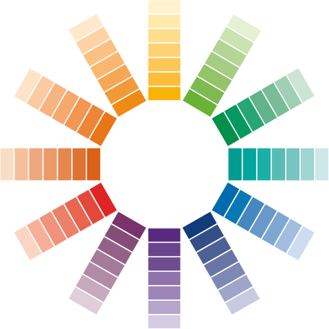
• Warm, clean colors, such as bright Reds, Oranges and Yellows tend to be active and more suited to spaces that are not used for resting.
• Cool colors, such as Blues, Greens and Purples tend to be more passive and are more suited for quieter spaces such as bedrooms, family rooms and dens.
• Neutral colors, such as beiges, tans, grays and whites are ideal for use in open-concept spaces to create flow between areas.
• Apply color samples to the most visible wall area in the room or space.
• To get a sense of how colors interact with other items in the space, arrange furniture or artwork around the dried color sample, as it would typically be seen.
• View the color sample through-out the day and especially during the lighting conditions in which the space will be frequently viewed or utilized.
• To visualize the same color in different areas, apply the paint color sample to a 2’ x 4’ piece of bristol/gypsum board so you can easily move it around.
• Use the same trim color throughout all rooms to provide a connection between rooms/spaces.

Introduction to Color
Color is one of the most important decisions you will make on a new build or remodel project. Take your time exploring, experimenting and dreaming!
Color can be calming, energizing, inspiring, uplifting, meditative, mood altering and more. By doing your research, you can find yourself, express your personality or create a mood using color.


