COLOR TRENDS FOR 2021
We now see Home and Workspaces in a whole new way. With a deeper understanding of how color createsrespite and reassurance, these hues will turn your living and work environments into a haven.

Color of the Year: SIMPLE SERENITY – 0614
Reassurance and calm are what we are all in need of right now, and with this in mind, we’ve come to view our homes and workspaces in a whole new light. Enter SIMPLE SERENITY; comforting, hopeful and full of possibility, this heavenly hue is our color for 2021. With some gentle inspiration, discover how this serene shade both restores and uplifts. Our color of the year, SIMPLE SERENITY, is paired with a carefully curated collection Off-Whites, Muted Natural hues and Soft Graphic complements to round out our 2021 Color Trends collection.
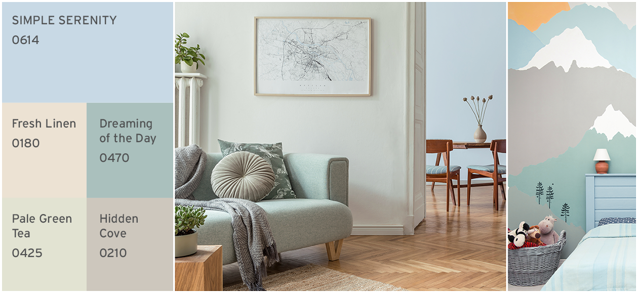
SIMPLE SERENITY is fresh and reassuring when balanced with a palette of soft natural tones. Teamed with muted neutrals Fresh Linen and Hidden Cove, this tinted blue gives living and dining areas a light and airy mood. A perfect fit for bathrooms; SIMPLE SERENITY and cool Pale Green Tea feel clean and energizing. Or be a little creative with these calming shades in a simple decorative mural for your little ones. Ideal for places of respite, this harmonious scheme is designed to restore and rejuvenate.
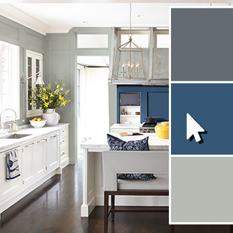
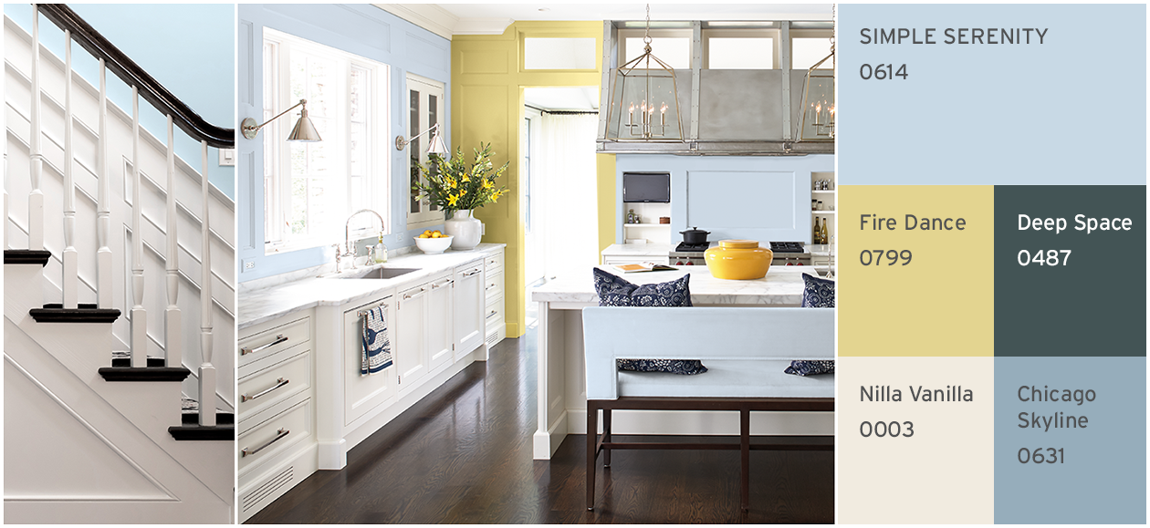
As part of a livelier palette, SIMPLE SERENITY feels clean and fresh. For a crisp kitchen update, apply alongside Nilla Vanilla and highlights of cheery Fire Dance for a sunny mood. Add the monochrome duo Deep Space and Nilla Vanilla on stairs and banisters to add dramatic definition. Or for a more subtle approach, the tonal transition between SIMPLE SERENITY and Chicago Skyline feels effortlessly modern, working well with smooth black furniture and vibrant yellow accessories.
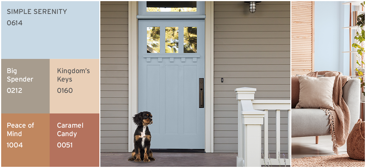
For instant reassurance and comfort, SIMPLE SERENITY brings a breath of fresh air when matched with earthy and sun-bleached hues. Acting as a complementary color, this gentle blue works perfectly with tonal light to dark Kingdom’s Keys, Peace of Mind and Caramel Candy. This is an ideal palette for creating a cozyatmosphere in bedrooms and snug living rooms. For painted exterior doors and woodwork, SIMPLE SERENITY is a welcome pop of color next to warm neutral, Big Spender.
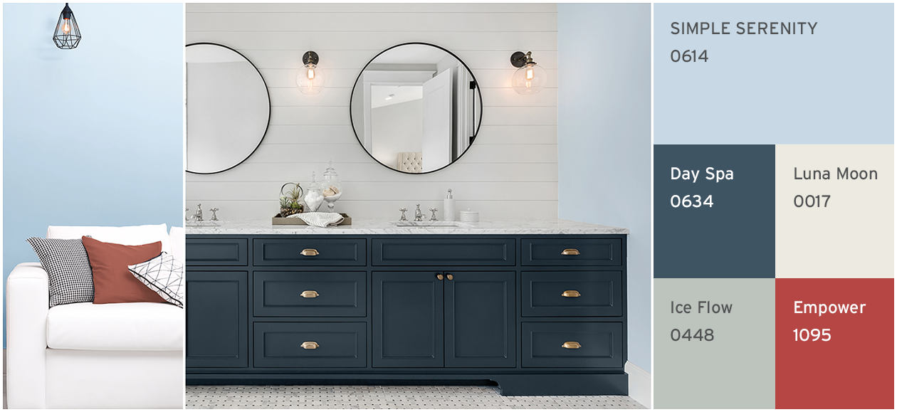
SIMPLE SERENITY is truly timeless in this nautical inspired palette. Sophisticated bathrooms have extra impact when SIMPLE SERENITY is defined with deep and dark Day Spa for cabinets, coupled with crisp Luna Moon and cooling Ice Flow for walls. For an even bolder look, accent this grouping with a flash of punchy primary red Empower. This contemporary color combination works beautifully for both interior and exterior paint projects.
