STEP 1 – Common Uses of Color
Color can be calming, energizing, inspiring, uplifting, meditative, mood-altering and more. Understanding how colors are used in design projects is a helpful approach to selecting color. Design professionals constantly monitor the latest research on psychological and physiological responses to color to create effective and stimulating designs. As you think about your project, consider the following color psychology to express your personality or create a mood.
Warm, clean colors, such as bright Reds, Oranges and Yellows tend to be active and typically more suited to spaces that are not used for resting.

RED
With the strongest energy of any color, Red is best used in rooms that require interaction or activity, such as dining rooms where it can be appetite-stimulating. Red also adds drama and works great for dens, hallways or powder rooms.

PINK
A pale red, Pink while associated with a delicate, feminine look, and is used to soften and lighten the look of rooms such as bathrooms and bedrooms. Pink is also looked upon as elegant, refined and poised.

ORANGE
Often considered the most social color, Orange is the color of creativity and imagination, and works great for family rooms and dining rooms. It also works well for bathrooms where its peach tones help complement skin complexions.

YELLOW
The color of happiness and optimism, Yellow connotates positive, cheerful feelings and is used to brighten practically any room. Yellow works especially well for “active/work” rooms, such as kitchens and laundry rooms.
Cool colors, such as Blues, Greens and Purples, tend to be more passive and are typically more suited for quieter spaces such as bedrooms, family rooms and dens.

GREEN
A cool and relaxing, color Green is also associated with health and fertility in addition to suggesting a feeling of renewal and growth. It is also considered a natural, neutral tone making it wonderful for living rooms, dens and bedrooms.

BLUE
The most peaceful of all colors, Blue exudes tranquility and contemplation. Exerting a soothing, calming influence, it works well for bedrooms and bathrooms. It is often also used with or as an accent color, as too much blue can tend to create a cold and dreary feeling.

PURPLE
The color of royalty, Purple tones evoke feelings of luxury and nobility. This majestic color works well in bedrooms, living rooms and bathrooms for a sense of lavish opulence.
Neutral colors, such as Beiges, Tans, Grays and Whites, are ideal for use in open-concept spaces to create flow between areas.

BROWN
An earth tone and the most natural of all colors, Brown helps to “ground” any color scheme. Brown is good for living rooms, dens and hallways, working best with an accent color that will keep it from becoming monotonous.

WHITE
The most neutral of all colors, White gets along well with practically any other shade. Offering elegance and sophistication, it is ideally suited to open up spaces and as a backdrop for kitchens, baths or any other room that requires a crisp, clean, well-designed look.

BLACK
A dramatic color, Black is most often used as an accent color to embolden other tones. It works perfectly with white to create classic, timeless motifs. Black can also be used with jewel tones to create sparkling, magical expressions.
STEP 2 – Simple Color Guidelines for Projects
Color is interpreted differently by each of us, based on our individual physiology, experiences, tastes and preferences. To ensure complete satisfaction, we recommend that you get a sampler and apply a small amount of the color in an inconspicuous area in the space and live with it for a time. You can also apply color samples to the most visible wall area in the room or space. Get a sense of how the color will interact with other items in the space by arranging furniture or artwork around the dried color sample, as it would typically be seen. Make sure to view the color sample throughout the day and especially during the lighting conditions in which the space will be most frequently viewed or utilized.
To visualize the same color in different areas, apply the paint color sample to a 2’ x 4’ piece of bristol/gypsum board and move it around.
EXTERIOR PROJECTS
- Make sure to research the appropriate traditional color schemes and time-tested ideas that work for certain styles of homes.
- Pick a color that complements the home’s brick, siding, stone or roofing as the case may be.
- Choose a color scheme that blends with the neighborhood. Make sure to check with your homeowner’s association, if you live in one, for any color restrictions/limitations.
- Color may appear differently depending on the time of day due to the lighting. As a result, we recommend that you paint a section of the house where the body, trim and accent colors can be viewed together, then check the colors throughout the day to see how they look.
- Highlight architectural details, such as shutters and columns by choosing colors that contrast with the wall/body color of the house. For example, if the wall/body is a light color, choose a darker color and vice versa.
INTERIOR PROJECTS
- Light colors work best to make rooms seem larger. Highlight room details or accent recessed areas with darker colors.
- Provide color hints by using items in the room. Pick a piece of furniture, art or even a pillow for inspiration, then select your color preference and see what other colors work well with it.
- Neutral tones with their understated sophistication are easy to understand. Your walls become a canvas that showcases your home beautifully with the perfect balance between captivating and calming, allowing artwork and furniture to become the center-point of design. Whether your home looks best dressed in warm or cool colors, the Rodda Paint Whites & Neutrals collection has the perfect shade for your walls, trim and ceiling.
- Ensure that connecting rooms share color elements to unify spaces or to create flow between them. For example, using the same color on molding in adjoining rooms unifies an open space.
- Create interest by using both light and dark colors. Emphasize attractive architectural features, such as moldings, columns, etc. by painting them in colors darker or lighter than the wall color.
- Do not forget the Flooring! The color of the carpet, tile, laminate or wood floor plays an important role in the feel of the room as well, as it will affect how the paint colors appear.
- Make sure to pay attention to the Trim in the room. Painting the trim and walls the same color removes attention from the trim and makes it less noticeable, while using a contrasting color for the trim gives it more of a focal point, adding some dimension to the room, making it more interesting. The same goes for doors — make an impression by painting your doors in a fabulous accent color or paint them in the same colors as the trim for a more blended look.
FAQs
What is the Best Paint Color for Interior Walls?
The best type of paint colors for interior walls are typically Neutral colors like Whites & Grays. Rodda Paint offers a variety of paints in different grades and finishes that are specifically designed for interior use. When you make your color selection, our Paint Store personnel can help guide you in choosing the right type of interior paint for your needs and budget. Make sure to pair your Interior paint with the appropriate primer that complements the Interior paint type selected for the best finish and durability.
What is the Best Color for the Interior of the House?
The most popular colors for the interior of the house tend to be Neutral colors, either in Warm or Cool tones like shades of gray or shades of white, because they are perfect for matching against any other type of color scheme, furnishings, floorings, accents, etc.
What is the Best Paint Color for Exterior Walls?
Same as for interior walls, the most popular type of Paint colors for exterior walls are simple, neutral colors such as beiges, grays, browns and whites as they tend to pair well with greens, browns and blues that are common in most yards and neighborhoods. Geographically though, you could see a leaning towards different colors such as lighter, brighter or darker shades. Furthermore, color availability is also influenced by sun exposure. Rodda Paint offers a variety of paints in different grades and finishes that are specifically designed for exterior use. Our Paint Store personnel can help guide you in choosing not only the right type of exterior paint for your needs and budget when you make your color selection, but can also advise on the colors best suited for your home’s sun exposure. Make sure to pair your Exterior paint with the appropriate primer that complements the Exterior paint type selected for the best finish and durability.
How many Colors should be on the Exterior of a House?
The general rule of thumb is that the Exterior paint color scheme for a house should usually have three colors: one for the Body, one for the Trim and the third for the Accent. This will give you flexibility and will also help keep things simple in the color scheme.
What is the Longest-Lasting Exterior Paint?
Generally, Acrylic paints tend to be considered the most durable paint for the exterior of the house. They are typically long-lasting, flexible, and capable of withstanding the sun’s harsh UV rays and other weather elements like wind and rain.
STEP 3 – How Light Affects Color
Natural and Artificial lighting play an important role in how we perceive color. Both Natural and Artificial lighting may alter the look of a color due to their varying temperatures. The paint color does not change, however, the reflected light bouncing off the surface changes the look of the color, which can be very obvious in some color ranges. Under cool lighting, colors may appear more blue, while under warm lighting, colors may appear more yellow or orange.
Natural lighting changes constantly throughout the day and across the seasons. The availability and actual strength of the Natural light depends on the number and size of windows in the room, which direction the room setting faces, as well as any outside structures that may block or affect the availability of light (i.e., an adjacent structure or building).
Direct sunlight is the most ideal light source as it provides the truest interpretation of color, providing the best balance between warm (yellow shades) and cool (blue shades) extremes.
Indirect sunlight is unpredictable lighting to assess paint colors due to its volatility. Indirect sunlight varies throughout the day and this inconsistency greatly impacts the color in a room. Intense gold rays of sunrise and long dark shadows of twilight “warm” and “cool” room colors respectively in dramatic fashion.
Artificial lighting provides a wide range of lighting temperatures or ‘looks’ and can be separated into either warm or cool light. Incandescent and Halogen bulbs enhance red and yellow tones, warming up a room while Fluorescent and Energy-saving bulbs enhance blue and green tones, cooling or flattening a room’s color. Artificial light will change how colors appear simply by the type of bulb that is used. Today, a popular artificial light source temperature is “Daylight”, which attempts to mimic the natural, balanced lighting conditions seen under a clear sky at midday.
Artificial lighting is measured using the Kelvin temperature scale and is found on most light bulb packaging to help in the selection of the ideal lighting for the setting. The most balanced light is considered Daylight or ‘Bright White’ and has a color temperature of approx. 5500K. ‘Cool White’ bulbs typically have a temperature of 4000K and may appear to give a blue cast in the settings. On the warmer side, bulbs considered ‘Warm White’ have a temperature of approx. 2700K and may appear to give a yellow, orange, or even a red cast in the setting.
Given such varied Artificial and Natural lighting combinations, it is important to choose paint colors in the space and lighting conditions under which the room is or will be most enjoyed. When considering paint colors, make sure to view them throughout the day in the setting where they will be applied.
FAQs
Do Paint Colors Look Lighter or Darker on the Wall?
It will depend on the paint finish Typically, Flat paint finishes can look lighter once applied to the walls since it absorbs light and can also have a chalky finish look.
How does Light Absorb Color?
Different surfaces and colors absorb different wavelengths of light, reflecting back a specific light wavelength or color interpreted by the human eye.
Which Color Absorbs More Light?
Black color absorbs the most light and heat, while white color reflects all wavelengths and absorbs the least amount of heat and light. Similarly, the color red absorbs less heat than the color blue. In general, darker colors absorb more heat than lighter colors.
What is the Best Paint Color to Reflect Light?
Lighter paint colors like whites, grays and beiges are the coolest or most reflective colors.
What Colors Make a Room Look Bigger and Brighter?
Lighter colors, such as off-white, are the best for making a room seem open and larger than it really is and are best suited for giving rooms an airy and open feel.
STEP 4 – Explore Color Harmonies
The color wheel defines how specific hues relate to one another and how colors can be selected in harmony. Two main color temperatures exist and divide the hues on the color wheel into Warm and Cool colors.
The relationships below use examples at higher chroma. For paint, most colors being used are much less Chromatic and are lower in value or ‘neutralized’.
Monochromatic
Variations/shades of one single color tint to create the most basic visual designs.
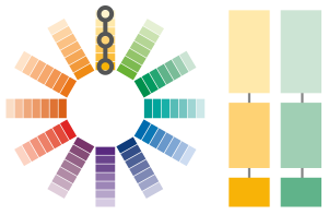
Analogous
Adjacent colors that create serene and comfortable designs.
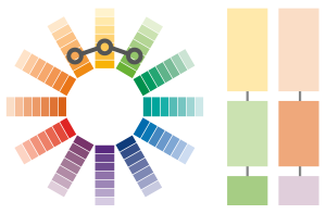
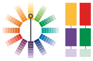
Complements
Opposite colors that create high-contrast vibrant designs that stand out, notably using fully saturated colors.
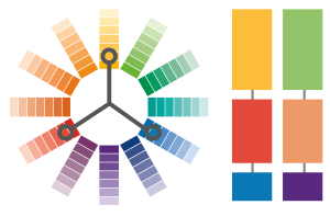
Triadic
Trio of colors to create high contrast vibrant designs using fully saturated colors. 1 Color is dominant while the other 2 act as accents.
FAQs
What are the Primary Paint Colors on the Color Wheel?
The three primary colors on the color wheel are red, yellow and blue.
How do You Make a Secondary Paint Color?
Orange, green and violet are the secondary colors, which are created by mixing two primary colors.
How many Tertiary Colors are There?
There are six tertiary colors, which are a combination of the primary and secondary colors… ‘Red-Orange’, ‘Yellow-Orange’, ‘Yellow-Green’, ‘Blue-Green’, ‘Blue-Violet’ and ‘Red-Violet’.
What is a Monochromatic Color Harmony?
A paint color scheme is considered to have monochromatic harmony when it is derived from a single hue and uses the same shades, tones and tints.
What are Examples of Complementary Colors?
Some examples of complementary paint colors are red and green, yellow and purple/Violet, and blue and orange.
STEP 5 – Put Your Colors to the Test
Color is interpreted differently by each of us, based on our individual physiology, experiences, tastes and preferences. Furthermore, the appearance of a color is also affected by the lighting conditions under which it is viewed and will appear differently throughout the day. When considering colors, view them throughout the day in the setting where they will be applied.
To ensure complete satisfaction, we recommend that you get a Rodda Paint Sampler and apply a small amount of the color in an inconspicuous area in the space and live with it for a time.
Tips
- Apply color samples to the most visible wall area in the room or space.
- Get a sense of how the color will interact with other items in the space by arranging furniture or artwork around the dried color sample, as it would typically be seen.
- Make sure to view the color sample throughout the day and especially during the lighting conditions in which the space will be most frequently viewed or utilized.
- To visualize the same color in different areas, apply the paint color sample to a 2’ x 4’ piece of bristol/gypsum board and move it around.
FAQs
How do I Test Paint Colors?
Always test paint colors on multiple walls since lighting can be different across different angles and rooms. Ideally, test the paint color on the wall and not a board as the wall substrate can affect the appearance of the color. Always use two coats of paint. For bright colors, make sure to test with a primer and pick paints based on the style of the room.
Is Paint Darker or Lighter than a Paint Swatch?
Flat paint finishes, once painted and dried, tend to appear lighter than the color on the swatch, while Glossy paint finishes can look darker after painting under certain lighting conditions.
Why Does My Paint Look Different on each Wall?
Paints have different finishes with different gloss levels. As a result, walls painted with the same color, but in different paint finishes/gloss levels, can look slightly different under the lighting or sunlight at different times of day.
Will a Second Coat of Paint Make it Darker?
Adding a second coat of paint adds more coverage, but will not make the color appear darker, richer or more intense.


